This week we have been pushing away at getting a build ready for play testing and displaying at Bar SK, where we will be part of the Work in Progress Wednesday this week!
It’s pretty exciting to be having our first public showing, and the whole team has been putting in the hard yards to both get everything working and to have the game looking as pretty as it can.
So today I’m going to give you a sneak peek at some of our new looks to show how far we have come since we started out waaaaaaaay back in … July.
So here are some screenshots of the levels that we put together for our first play test in late July:
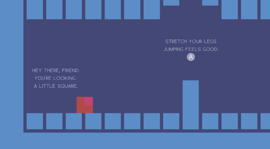
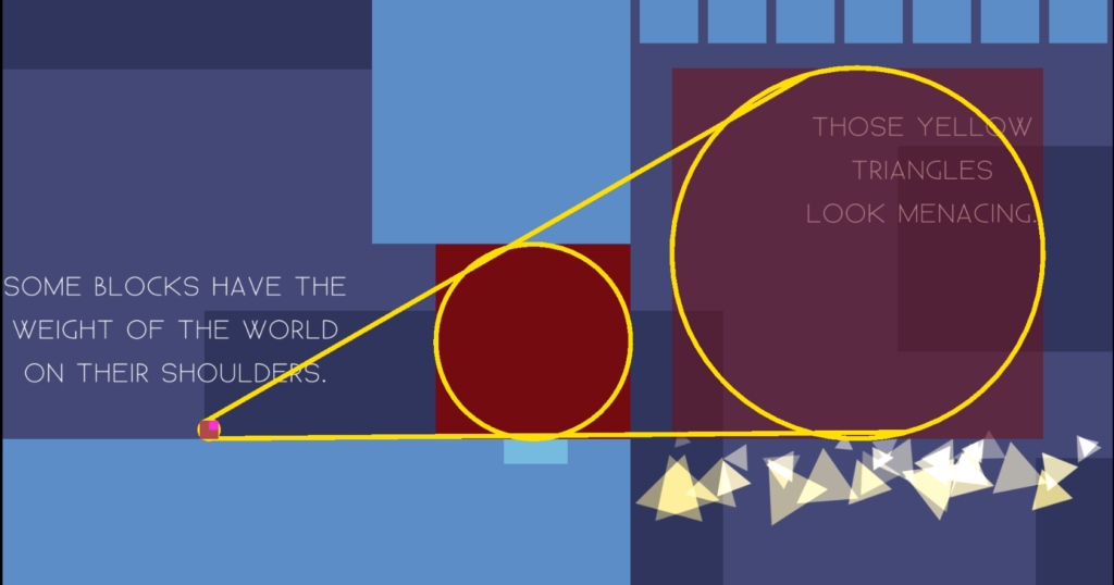
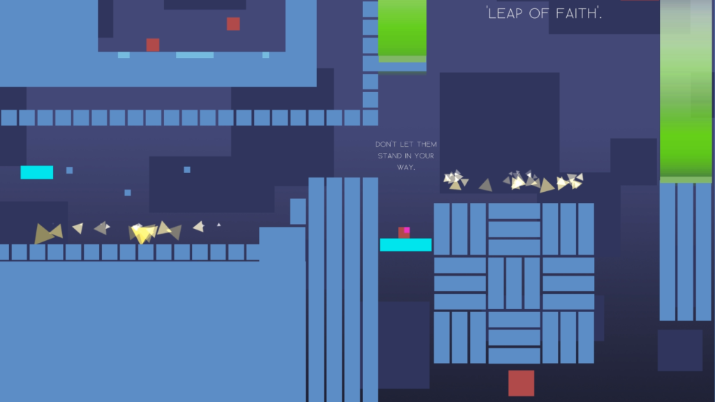
And here are some shots of the build that we are getting ready to show on Wednesday:
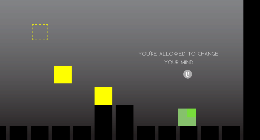
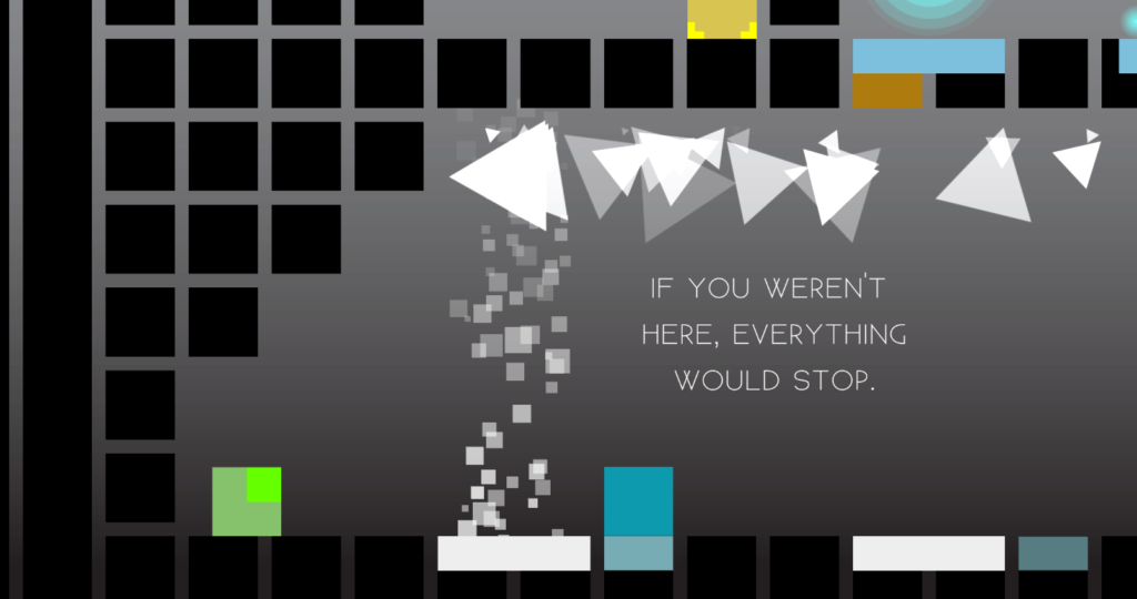
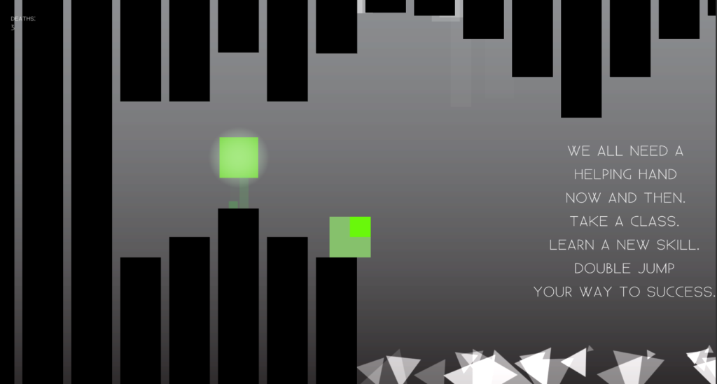
So as you can see, we’re trying to keep our design quite minimal and basic, with just a few colours and shapes to communicate to the player what is going on. You can see that there is still a bit of text present within the game, to let the player know what is going on and what they are able to do as well.
But altogether, I think the aesthetic is coming together well.
And to wind up, I’m going to acknowledge that a lot of the issues that I identified in earlier posts – to do with roles and responsibilities and clearly working out goals and tasks and so on – seem to be working out a lot better now.
Part of this probably comes down to me feeling a lot more positive about our game in general. But it also comes down to us having actually gotten together and put in the effort to get all of those things worked out.
What this means is everyone now knows what they are responsible for, and who to go to if something needs doing.
Which seems to have flowed on to a much better pace of development. Though, again, this might just be down to me feeling better about where we are heading!