OK, no more wallowing in self reflection, this week I’m actually going to talk about making some stuff!
This week I’ve been working on our main menu.
I posted a pick of our logo last week, but if you missed that, here it is again!

I’m using this as the basis of the games main menu, with each of the letters being a button. The first “L” will start the game, the “V” will display the game controls, the second “L” will access the credits, and the “2” will quit.
Our artist made all the parts into separate assets so that I was able to build the landing screen in Unity so that it looks exactly the same as the logo.
Then I set up each button to load the respective menu page, or to load the game or exit, or whatever. It did the job that it was supposed to, but it wasn’t particularly exciting or pretty.
One of the key concepts of our game is “Levels within Levels”. Within each level, the player can enlarge certain objects and enter them, to find entire new levels within. Basically, rather than finishing a level and entering the next, the next level is within the level currently.
So to step into this mindset, I made an animation to draw the camera into each button as it is pressed – like so:
That made the buttons feel a little more dynamic, but the info on screen was still a little static.
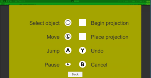
Here is the instructions page as an example:

This page would just appear once you entered into the “V” in the logo. This time, I decided to animate all of the icons jumping up from the bottom of the page and settling into place in a kind of cascading effect.
It ended up looking like this:
Which looks pretty nice I think.
Obviously these are all works in progress, and are likely to change before we are done, but it’s a pretty simple addition and adds a bit of pop to the game when we have people come and play and show it off.
Clearly, we still need to make the actual game. That bit is pretty important.
But to close – here is a GIF of everything added together:
Disclosure: I am not a UI designer and haven’t had any specific UI training. This is just a record of my bumbling through the process and learning to make something that looks good. Feel free to take whatever lessons that you want from this, or to quietly scoff at my amateurism.
Whew – feels nice to actually be talking about making something.
So, if anyone has looked, I had a bit of a boo-boo over the weekend, and the last post has been lost. (If anyone is downloading and saving posts as they read them it might be recoverable? That’s probably not happening…)
Anyway, I now have an SSL certificate installed and have set up some security measures as well as automated backups.
Kinda learning/making this blogging thing up as I go, so it might be a rocky trip but we’ll end up somewhere…