Well, first of all – it’s been a couple of weeks since I last posted. Sorry about that. I’ve been working on assignments for uni and it all got a bit too busy to manage to squeeze any sort of decent blog post.
So to make up for that, I’m finally going to go over the level design pipeline that we are using for the new development phase of Level Squared.
We’re in the early stages of developing new levels at the moment, and our primary aim is to build our prototype up into a full length game.
The prototype that we have is a very simple introduction to our mechanics, introducing them one after another, then finally presenting one large level at the end where you get to use everything together.
So what we are aiming to do is to spread out those mechanic introductions a little and make sure that players are completely comfortable with each of them before introducing a new mechanic. Then after a couple of levels of the new mechanic, we will have a level that combines it with an earlier mechanic or two (depending on how many there have been obviously), then finally, we close out that phase with what I’m calling a ‘challenge level’ – basically a larger level that requires the player to pass a few more difficult challenges using the abilities that they have at that point.
Some of the games that I’m drawing on for level building inspiration are:
- The Donkey Kong Country series, which are real good at iterating on a mechanic and doing interesting things with their levels.
- Portal and Portal 2, which again, are great at introducing a mechanic and getting the player comfortable with it before making them stretch to carry on.
- and LIMBO, particularly the secret dark level, which does a fantastic job of getting the player to learn the patterns of the hazards to the point that they can be avoided by sound alone.
Now, I’m not going to claim that there aren’t better games out there. These are ones that I have played a lot though, and that I feel are a good fit for the sort of challenge we are aiming for for Level Squared.
So let’s start with the first set of levels. These levels aim to introduce the player to basic movement and jumping, as well as how death works.
To start off, I’ve drawn up a table of the concepts and design guidelines for each level:

This is obviously pretty basic stuff, and is just intended as a jumping off point.
As you can see, I’m starting off with the existing version of Level 1 that existed within the prototype (no need to duplicate already completed work!).
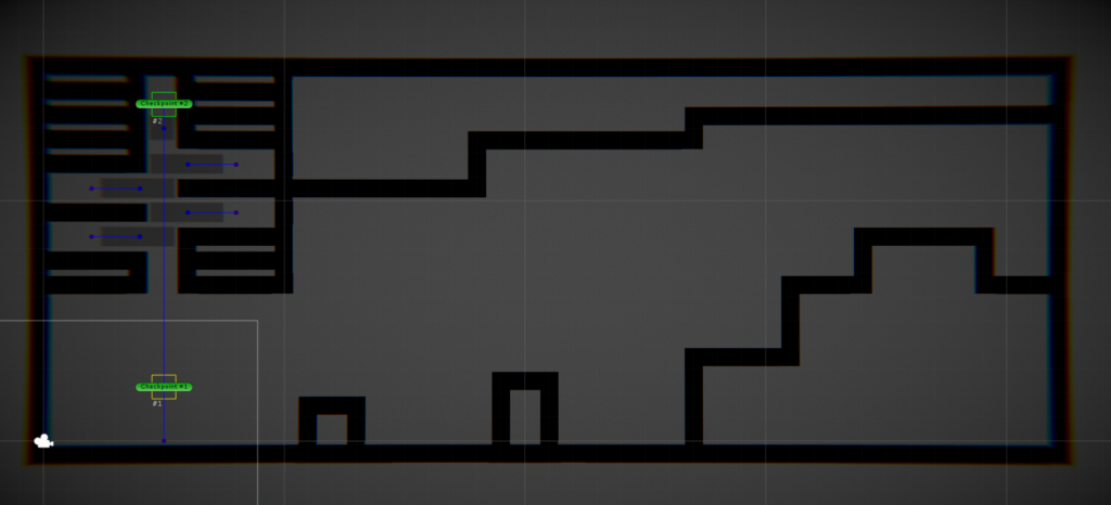
Level 1.2 I’ve made as a vertical version of Level 1. Basically the same idea, just getting the player to climb up instead of progressing to the right.
Here’s the early build in Unity:
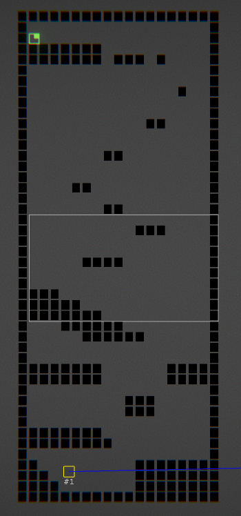
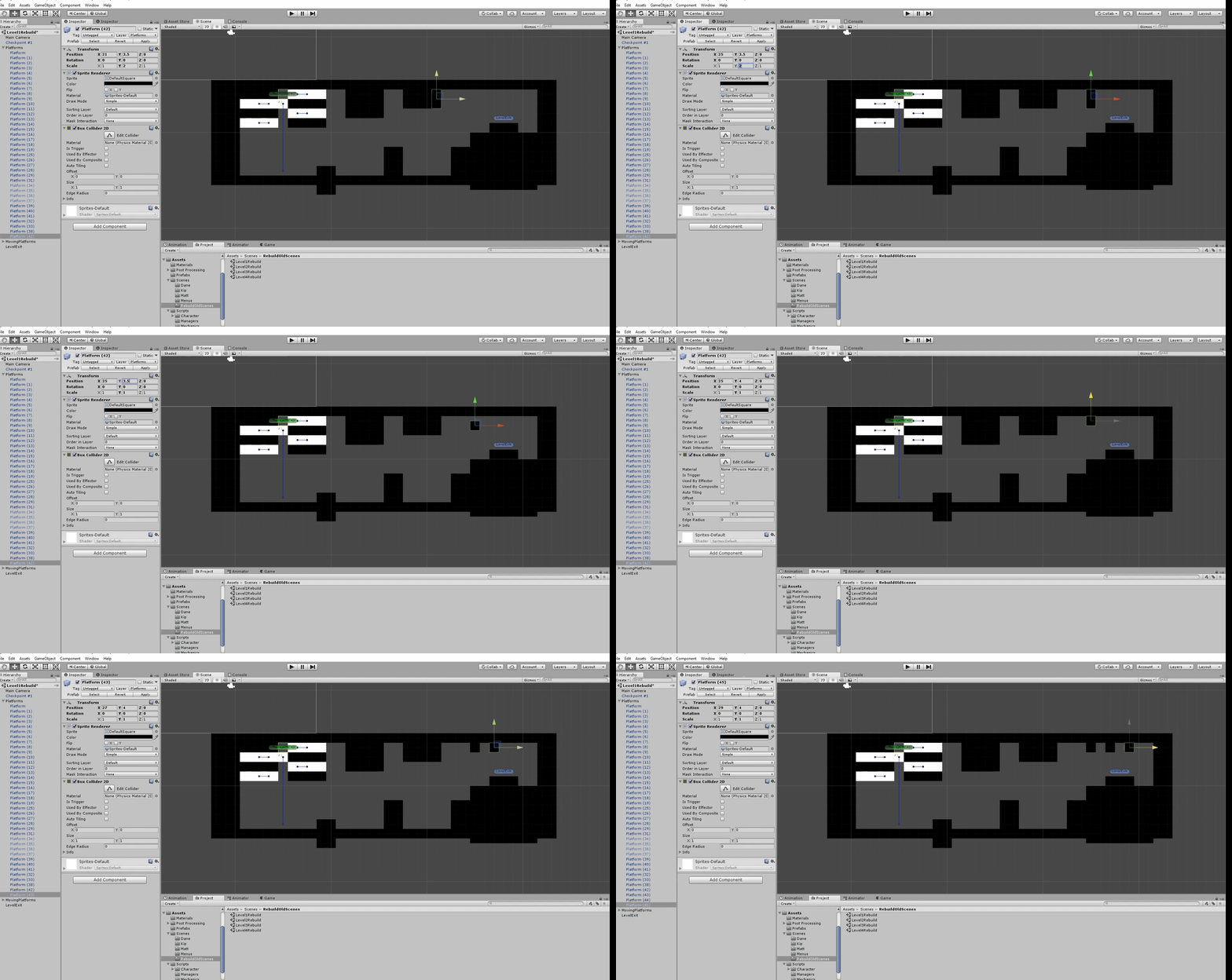
This is still pretty bare bones at this stage. It’s mainly a matter of getting the level parts into the correct positions. This step involves a lot of placing blocks within the level, going in to play through, then moving blocks by small amounts to fix all the errors that I made on the previous pass.
Important things that need to be right at this stage include:
- The player needs to be able to make all jumps with a single jump. They will not have access to a double jump at this stage.
- Jumps need to be challenging enough to interest the player, but not so difficult that an unskilled player cannot make them. This level is an introduction, we need to keep in mind that players are still learning the game at this point.
- The level should start easy, but get more challenging as the player progresses. You can see this as the platforms that the player will be aiming for get smaller and smaller as they climb higher.
- There isn’t really any loss condition at this point. We haven’t introduced death or anything deadly. So even if the player does fail to make a jump and falls a great height – they learn that this won’t kill them.
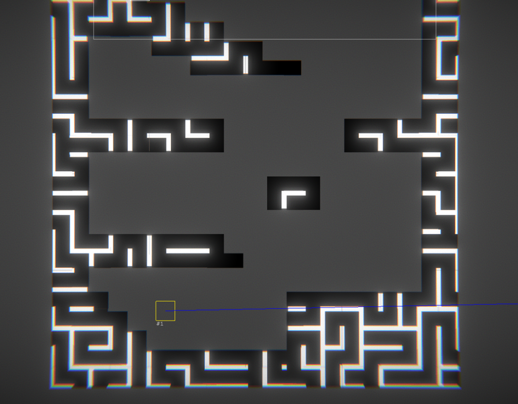
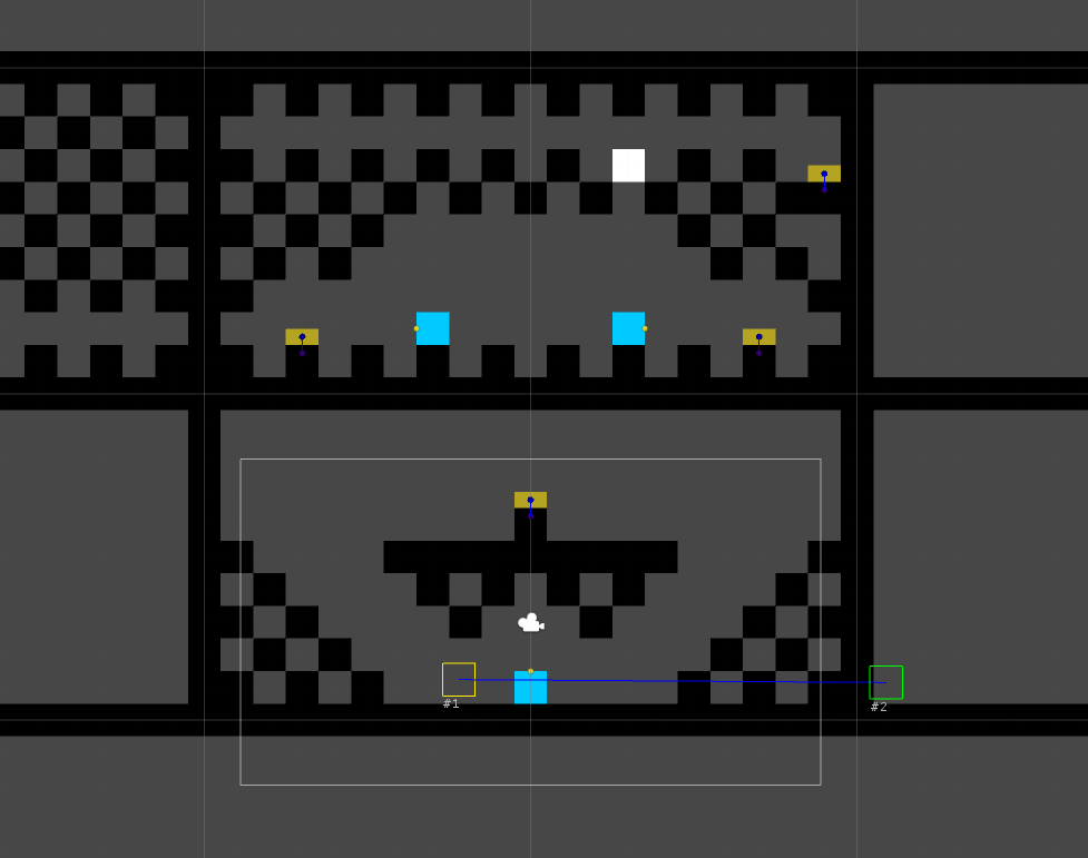
Then, once I’ve built the level to the point that I am happy with, I send it across to our artist Mark. Mark then paints over the basic design that I have created and makes it look all nice.
Like this:
Something we have already identified as a problem is that this art style doesn’t present well on single lines of blocks. It relies on having a gap between blocks to apply the bright white internal areas. And there are a few places within the drafted levels that I have used single blocks, or lines of single blocks, to make more challenging jumps. So we will likely have to look into that in the coming weeks.
And finally, Mark passes the newly arted level across to Dane in our programming team, who does a pass over the level to fix all of the programm-y bits that I broke or failed to set up properly when I was putting the level together.
And then … we’ll be ready to start doing some play testing. At which point, we’ll probably have to start all over again.
One thing that I’m worried about with these new levels and the new overall game progression plan, is that it’s going to potentially be a long time before the player gets access to projection – and that’s kind of the main point of our game.
But we’re not going to know if the play length is right until we have enough built that we can get this in front of people to see what they think.
Our plan is to do a repeat of last year. We built the entire first version of Level Squared of the semester break of uni. And we’re aiming to get a big chunk of this version done over the same period of time.
So we’ll see how we go with all of that. It’s a fair chunk of work laying ahead of us, but we’ve been pretty slow to get back into action this year, so I’m hoping that this push is what we need to get Level Squared built out into the full game that we believe it can be.
Also, this has somehow evolved into a 1000+ word blog post, so hopefully that goes some way towards making up for no post for the last two weeks!
